
The product packaging can make or break your product’s success. Since the package is the first impression of your brand that the consumer gets of your product, your business will want to put its best face forward.
There are a lot of factors to consider and the design you end up settling on can be a complicated process, but no one knows your product better than you or how important it is to customers. The look and feel of the brand must be conveyed effectively. The product packaging has to reflect that passion to make an impression on your consumer base.
When considering the look of your brand, how to appeal to your core audience, and how to attract other potential customers, here are a few tips and tricks that will get eyes on your product:
1. Know your audience

The first step to getting your design down is understanding whose eyes you’re trying to attract. The packaging should not only reflect the brand, but should accurately match the style of the customer.
For example, a product aimed at the middle-aged men demographic would not have a motif suited for little girls. This is one of the first (and most crucial) steps to marketing, let alone to deciding what the customer should see in your product.
2. Know your product
Once you know your audience, the next important thing is to know your product. Think of what your product is, what it does, and what opinion your core customer base already has of it. For instance, a tech product often goes for a simplistic, sleek, ease-of-use design for a futuristic tech motif.
Another example is that a work-out product would want to use powerful images or a more intense colour motif to reflect the intense workout culture it appeals to. Your product and your packaging should match up, end of story.
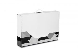
3. Use shapes to stand out

In design school, students are taught that the eye is drawn to shape and that the uses of shapes give off certain feelings towards the product. Rounder shapes are less jarring and give way to a sleeker looking design whereas triangles and sharp edges are often associated with strength and stability. Squares lend to a more ordered, contained look.
A combination of these shapes give off a combination of feelings, like serrated edges on circle label designs which smoothly contain a word while drawing attention to it.
4. Simplicity is a virtue

Don’t complicate things, make your design as basic and iconic as possible. If you look at the biggest brands of the decade (Nike, Apple, etc.), they all tend to have more simplistic logos and packaging. In addition to a basic look, you also want to vie for a unique design that’s completely original to you.
With a few simple curves, Nike reclaimed the checkmark in a stylistic way. Your packaging design should aim for something similar for maximum recognition amongst your customers.
5. Make a package that elicits a reaction

Whether it’s a warm feeling or some kind of motivational prompt, one of the best ways you can connect to your audience is by eliciting a reaction. Workout products tend to instill a “can-do” demeanor in their target audience where naturally sourced health products may promote a more harmonious “one-with-earth” feeling.
Whether your product presents a call-to-action, a feeling of warmth and safety, or technological innovation that propels the customer into the future – you want to identify what impact your product will have on the consumer and reflect that feeling accordingly through the package.